2026 Top Tips to Improve Digital Print Quality?

Time:2026-09-25 Author:Sienna
0%

Digital print quality is rarely fixed by one setting. A sharp file can still look dull when the paper absorbs too much ink, the press needs calibration, or a screen preview hides color shifts. Frank Romano, printing-industry expert and professor emeritus at the Rochester Institute of Technology, is often quoted as saying, “Print is not dead; it is just changing.” That change makes consistent quality more important, not less.

This guide explores how to improve print quality in digital printing through practical checks at each stage. Start with the artwork: inspect image resolution at final size, keep important details away from trim edges, and confirm that the color profile matches the printer’s workflow. Then examine the press itself. A faded gray patch, uneven solid color, or soft type can point to different problems, so adjust one variable at a time. Small test prints help. So does a clean, documented calibration routine.

Paper matters, too. A coated sheet may preserve fine detail, while an uncoated stock can soften edges and change color. Judge the result under consistent lighting, not only on a bright monitor. Ask the operator to record settings and compare samples against the approved proof. That sounds basic. It is often skipped.

No checklist replaces experience with a specific press and substrate. Even so, repeatable measurements and careful observation make troubleshooting more reliable. Some jobs will still need a second pass. That is worth admitting. The tips ahead offer a clear starting point for sharper text, steadier color, and fewer avoidable reprints.
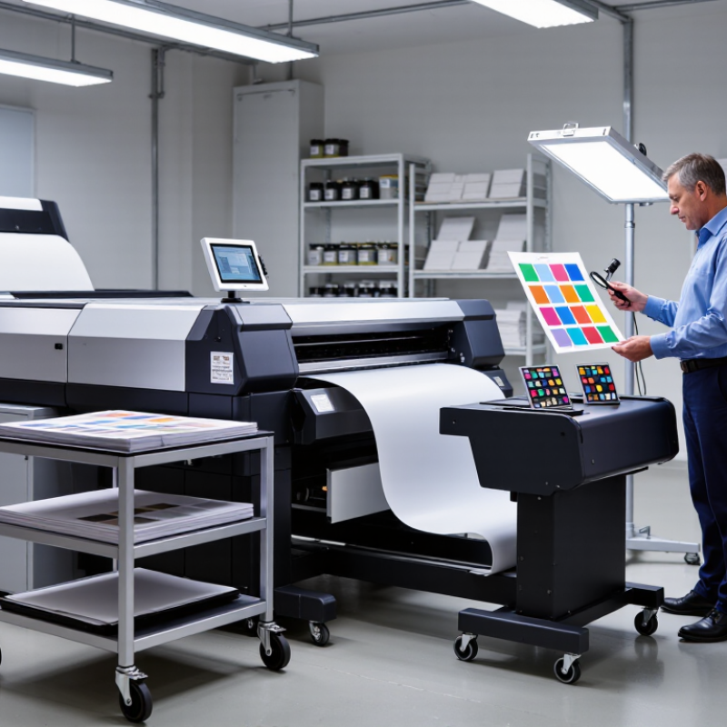
2026 Top Tips to Improve Digital Print Quality?

Understanding the Core Factors That Affect Digital Print Quality

2026 Top Tips to Improve Digital Print Quality?
Understanding the Core Factors That Affect Digital Print Quality

Digital print quality starts before the first sheet runs. Resolution, color management, substrate, and machine condition all shape the result. A low-resolution image may look acceptable on screen but reveal jagged edges in fine text. Meanwhile, an uncalibrated device can shift a neutral gray toward green or magenta. Paper matters, too: its coating, whiteness, and moisture affect ink absorption and color appearance. It is tempting to blame the press alone. That misses the file and the room around it.

Measurement needs consistent conditions. ISO 13655:2017 defines four color-measurement modes: M0, M1, M2, and M3. Different modes can produce different readings, particularly on papers containing optical brightening agents. This standard is a useful technical reference for setting up color checks; it is not a substitute for checking the actual printed sheet under suitable lighting. A number can look reassuring. The page may still look wrong.

Tips: Calibrate the device, then confirm the paper profile matches the stock. Inspect a proof for small text, smooth gradients, and neutral grays. Keep the room lighting consistent, and record measurement mode with each color reading. Recheck after changing paper or settings. I would not skip this—even a careful workflow can miss a subtle cast.

Choosing the Right Materials, Inks, and Printing Equipment

Print quality starts with the surface, not the printer. Coated paper can hold fine detail, while textured stock may soften small text and thin lines. Check the material’s weight, absorbency, and finish before choosing a print method. A quick test sheet can reveal smearing, uneven color, or poor adhesion. Small tests save waste.

Ink must suit both the substrate and the equipment. Water-based inks may behave differently on porous and coated surfaces, so confirm compatibility and drying requirements. On a sample, inspect dark areas for pooling and fine edges for feathering. Let the print dry fully before judging its color; wet ink can look misleading. It is easy to rush this step.

The printer matters, but setup matters just as much. Select the correct media setting, resolution, and color profile, then check alignment and nozzle condition. Keep the print area clean, and use consistent lighting when comparing samples. Temperature and humidity can affect feeding and drying, especially during long runs. A small color shift may still appear between batches, even with careful settings, so record the material, ink, and printer adjustments that worked. One detail is often missed: a perfect screen preview cannot predict every surface’s finish.

Preparing and Optimizing Digital Artwork Before Printing

Preparing artwork well can prevent soft edges, clipped text, and unexpected color shifts. Build the document at its final print size, then check the printer’s requested resolution. For many raster images, 300 pixels per inch works well at final size, but large-format jobs may need less. Ask the print provider before enlarging a small image; extra pixels cannot restore missing detail.

Check the edges. Add bleed where background colors or images reach the trim line, and keep important text safely inside it. Use vector artwork for logos and clean shapes when possible. Embed fonts or convert text to outlines, while keeping an editable copy for revisions. Set the correct color profile if one is supplied. Screen colors are not print colors. A bright blue on a glowing monitor may look muted on paper, so request a proof for color-critical work. Zoom in to inspect thin lines and small type, then review the exported PDF at actual size. It is easy to overlook a stray hairline or a low-resolution photo. I still find that one final check catches more than another round of guesswork.

Controlling Color, Resolution, and Printer Settings

Digital print quality starts with a reliable file. Use the resolution recommended for the finished size, often around 300 pixels per inch for close-viewed images. Enlarging a small web image rarely restores missing detail. Check fine lines and text at actual print size; a sharp screen preview can still hide rough edges. Color needs equal care. Use the color profile specified for your print process, and avoid repeated conversions between color spaces. A soft proof can reveal dull reds or shifted grays before you print. It is useful, not perfect.

Tips: Print a small color test strip. Compare it under the light where the finished piece will be viewed. Keep a note of the profile, paper, and settings used.

Printer settings can change the result dramatically. Select the correct paper type, because it affects ink limits and drying behavior. Choose a quality mode suited to the job, rather than assuming the highest setting is always best. Feed one sheet first. Look for banding, uneven fills, or colors that appear muddy. If output differs from the preview, check the file profile and driver settings before adjusting the artwork. Change one setting at a time; otherwise, it is hard to know what helped. Even careful workflows can miss something, so keep a printed reference nearby.

2026 Top Tips to Improve Digital Print Quality

Choose an output resolution suited to the image and print size. These are common resolution settings; available options vary by printer.

Tip: For detailed prints, use a high-quality source image and an appropriate resolution setting. Also select the correct paper type and use color-managed workflows for more consistent color. Higher DPI alone cannot restore detail missing from a low-resolution image.

Inspecting, Troubleshooting, and Improving Final Print Results

2026 Top Tips to Improve Digital Print Quality?

A reliable quality check starts before the full run. Print a small test sheet on the actual stock, then inspect it under neutral, even lighting. Look for banding, soft edges, uneven fills, and color shifts. Check fine text and thin lines with a magnifier. Small defects often disappear on screen but show clearly on paper.

When a problem appears, change one setting at a time. Confirm the selected media matches the sheet’s weight and finish, and make sure the file uses the intended resolution and color profile. If colors look dull, compare the test print with a calibrated display; room lighting can mislead you. Check ink or toner levels, printhead condition, and feed alignment before adjusting saturation. I sometimes blame the file too quickly. That wastes paper. Record each change and its result, even when the fix seems obvious. Reprint the same test area after adjustments, and allow ink to dry before judging color or sharpness. Glossy stock can look different once fully dry. If results remain inconsistent, pause the run and inspect a fresh sample rather than trusting the first acceptable sheet.

FAQS

What factors most affect digital print quality?

Image resolution, color management, paper, and machine condition all matter. A file can look sharp onscreen but show jagged text on paper.

Why can printed colors differ from screen colors?

Displays and printers use different color systems. Uncalibrated equipment may turn neutral gray slightly green or magenta.

How should I check a print before a full run?

Print a small test sheet on the actual paper. Inspect fine text, thin lines, gradients, and solid fills under even lighting.

Why does paper choice affect color?

Coating, whiteness, and moisture change how ink absorbs and appears. The same file may look different on glossy and uncoated stock.

What should I check when colors look dull?

Confirm the paper setting and color profile first. Check ink or toner levels, printhead condition, and feed alignment before changing saturation.

Why should color readings include a measurement mode?

Measurement modes M0, M1, M2, and M3 can produce different readings. Record the mode, especially when paper contains optical brightening agents.

When should I judge sharpness and color?

Let the ink dry before judging the sample. Glossy paper can change in appearance as it dries.

What should I do if print defects keep appearing?

Change one setting at a time and record the result. Reprint the same test area. I sometimes blame the file too quickly; that wastes paper.

Conclusion

Improving digital print quality in 2026 starts with understanding how materials, ink, equipment, and working conditions affect the final result. Choose a suitable substrate and compatible inks, and keep printing equipment clean and properly maintained. Before production, prepare artwork at the intended print size, use sufficiently high-resolution images, embed or outline fonts when appropriate, and check that colors and layouts are ready for output. These steps help answer the practical question of how to improve print quality in digital printing while reducing avoidable defects.

Next, calibrate color settings, select the correct print mode, and match resolution and media settings to the job. Make a test print before running a full batch, then inspect it for color shifts, banding, blurred details, and alignment issues. If problems appear, adjust one setting at a time and print another sample. Regular checks, careful troubleshooting, and consistent maintenance help produce clearer, more accurate, and reliable results.

Sienna

Sienna

Sienna is a skilled marketing professional with a deep expertise in our company’s core products and services. With a passion for innovation and detail, she plays a pivotal role in crafting insightful blog posts that not only highlight the unique features of our offerings but also provide valuable......